The Advanced Graphic Design Class is working with an outside client to design a logo for the Edgecombe County Tourism Association and this is my research for that commission.
I have been allowed to create a Cooking/Recipe Column for the school paper! So, for my first article I created a recipe for a Homemade Pumpkin Spice Latte that is a healthier alternative to the Starbucks beverage. Instead of a photograph to go along with my article, I created this infographic. I absolutely love it, and I can't wait to see it in the paper!
This Infographic shows the recipe for the homemade pumpkin syrup that goes in the Latte.
I began with Referencing a standard color wheel and another infographic that I loved, which referenced emotions in correspondence with colors. I love this concept because I am such a visual thinker and I really do associate concepts with color.
For my own infographic I wanted to incorporate a variety of concepts that could be associated with color, and I wanted to continue my work with geometric designs.
I was inspired by these designs as well:
I began with a basic plan which i drew out in photoshop:
Then I designed the rest in Illustrator. Here is the final result:
I am so proud of this piece, it is my favorite graphic that I have designed so far!
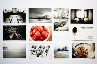
I really want to work on my business card that shows off some of my newer, more directed work. I really love the concept of black and white photos with a few bright colored ones.
I love these compositions by artist Josef Albers and I think I might include the composition ideas for one of my photos and incorporate them in to some kind of logo design.
With the upcoming Barton Production of Peter Pan, I am currently hunting inspiration for a poster design...
I really love the silhouetting in both of these posters, because I feel like the characters are so iconic, they aren't necessarily Disney-associated when they are silhouetted. Also I love the second one that has the huge Big Ben Clock in the background. although I think I will want to do something involving the star in the background and size down the clock so that it's still relevant, but more in-balance with the star. I want to emphasize the London- Neverland presence within the show.


