The Advanced Graphic Design Class is working with an outside client to design a logo for the Edgecombe County Tourism Association and this is my research for that commission.
I have been allowed to create a Cooking/Recipe Column for the school paper! So, for my first article I created a recipe for a Homemade Pumpkin Spice Latte that is a healthier alternative to the Starbucks beverage. Instead of a photograph to go along with my article, I created this infographic. I absolutely love it, and I can't wait to see it in the paper!
This Infographic shows the recipe for the homemade pumpkin syrup that goes in the Latte.
I began with Referencing a standard color wheel and another infographic that I loved, which referenced emotions in correspondence with colors. I love this concept because I am such a visual thinker and I really do associate concepts with color.
For my own infographic I wanted to incorporate a variety of concepts that could be associated with color, and I wanted to continue my work with geometric designs.
I was inspired by these designs as well:
I began with a basic plan which i drew out in photoshop:
Then I designed the rest in Illustrator. Here is the final result:
I am so proud of this piece, it is my favorite graphic that I have designed so far!
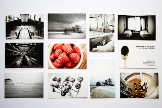
I really want to work on my business card that shows off some of my newer, more directed work. I really love the concept of black and white photos with a few bright colored ones.
I love these compositions by artist Josef Albers and I think I might include the composition ideas for one of my photos and incorporate them in to some kind of logo design.
With the upcoming Barton Production of Peter Pan, I am currently hunting inspiration for a poster design...
I really love the silhouetting in both of these posters, because I feel like the characters are so iconic, they aren't necessarily Disney-associated when they are silhouetted. Also I love the second one that has the huge Big Ben Clock in the background. although I think I will want to do something involving the star in the background and size down the clock so that it's still relevant, but more in-balance with the star. I want to emphasize the London- Neverland presence within the show.
He began his creative career painting natural objects such as trees and other landscapes in a post-impressionistic style. He then transitioned slowly from representational pieces of trees and landscapes, to more abstracted representations of trees and landscapes
After being proficient in impressionism he began to really experiment and incorporate cubism into his work.
This is what led him to fall in love with "Pure Abstraction".
This website (link below image) displays beautiful works of art from the "Bauhaus" movement. I love this site because it showcases all types of design platforms: photography, illustration, graphic design, typography, etc. It's a great gallery with a wide variety of work and examples!
The Made Shop on tumblr is a blog that displays both found work and work done by the owners. It is a great source for design inspiration. They post work from several different design styles as well as lots of creatively innovative pieces.
I enjoy Design Cloud because it is another site that shows a collection of work with a wide variety, but within one localized area (New York). It is interesting to see what sorts of designs are popular within a specific area. It shows what sort of creative concepts are being shared and what is growing in popularity.


%2C_oil_on_canvas%2C_70_x_99_cm%2C_Gemeentemuseum_Den_Haag.jpg)

%2C_oil_on_canvas%2C_79.7_x_109.1_cm%2C_Gemeentemuseum_Den_Haag%2C_Netherlands.jpg)


